Saturday, 14 December 2013

The Language of Progress


Streets Clock by Fluid Forms and John Briscella
2008.
This clock is made by superimposing a street map onto a clock face. This data is then sent to a laser cutter, to cut the clock face out of a sheet of acrylic or wood. Fluid Forms has set up an online shop so that customers can choose their own place and create a personalised decorative piece for a gift or their own use.

I really like this piece because each clock is likely to be unique, even if the same place was chosen, due to the map image selecting process. I also really like the intricacy of the clocks and the find the concept of combining space and time very clever.

This work reminds me of Rob Ryan's papercutting in style, because of the cutting away of negative space element. This work also reminds me of Claire Brewster who also uses paper cutting, to create images of birds from maps to represent their migration routes.

The only real relationship between Fluid Forms and my work is the process of mapping data but our design concepts are not very closely linked as I am more interested in fashion/fashion accessories and this work is more homeware.


Friday, 6 December 2013

Textile World Feedback Session

After finally finding my group, I found the feedback session very helpful. At first I was a little unsure about going into Mixed Media and felt Embroidery would be equally appropriate for me, however after sitting and discussing the worlds with other students, and viewing the kind of work they produced, I feel reassured that Mixed Media was the best option. I feel embroidery  I'm looking forward to learning the range of techniques used in this world and attending all the workshops.

I also found the feedback good because it gave me a chance to show case my own work which in turn received many compliments, which is always a good confidence boost especially after receiving sumative feedback, where constructive criticism can sometimes be dis-heartening.

Wednesday, 4 December 2013

Sampling Research

I found the concept of visually recording time, movement and space very thought-provoking. On my journey to the Macnhester City Art Gallery I recorded my how many and which songs were played on my iPod, the banner-signs of the establishments I passed along the way and how many magpies I saw on my trip. I am looking forward to exploring the different ways of visually communicating this information. At the moment I am considering the use of stitching, collage, typography and inks.

Once at the gallery I enjoyed taking photographs in order to show how my eyes see things. After looking at various pieces of colourful ceramics, colourful 3D textiles and a particularly striking painting of a magpie, I then took the time to record all of the things my eyes spent a lot less time looking at, for example the bland but intricate plant paintings and the frames and wall space the works were mounted on. With this information I plan to reproduce my favourite pieces of work and place them at the center of a kind of patchwork composition with the more geometric and less interesting aspects of the gallery to me.

I also really enjoyed the Grayson Perry tapestry exhabition at the gallery and took inspiration from his use of text and illustration in weaving.
http://www.artfund.org/what-to-see/exhibitions/2013/10/24/grayson-perry-the-vanity-of-small-differences-exhibition

Thursday, 21 November 2013

PE Evaluation

I feel my project has really developed through the origins unit. In the first two weeks whilst completing my chance cards, I found it quite hard to make myself sit and endure such a large amount of drawing and I felt that such a vague task left me with little direction in terms of a theme or complete project. Fortunately once in my textile world I felt that the tutors supported me and helped me find a theme to develop in my sketchbook, in order to inspire a colour pallet and compositions in my practical work.
I have chosen to narrow down my main area of research to drawings of my environment, mainly focusing on plants, flowers and trees. I particularly find the contrast of plants and built up areas a point of interest and a good basis for my colour pallet.
During this project I have discovered that I probably have more patience for a slow moving production of textiles (e.g. weaving) than for a faster production of samples that has a higher risk of going wrong (e.g. knitting) so in the future I will have to consider which techniques will be most appropriate in the given time scales. I have also learnt which drawing style suits me best, and the importance of a sketchbook during practical work, where I once thought one irrelevant.
I found contextual references very helpful when looking for inspirations, for example seeing the work of other knit and weave artists helped motivate me to find out new techniques to create similar effects. Also to find out how using different yarns can make such a big impact on the composition of my work especially if washed or treated after construction.
I feel I have been using my workshop time very wisely, often enjoying full days in the construct workshops. My independent time has been used wisely for the majority of the unit, I think if I had spent a little more time practicing drawing, I would have found putting my sketchbook together a lot easier. Having said that even when my independent time has been used visiting friends or family, I have always made visual recordings of my surroundings when appropriate to add to my research.
At the start of this project, my thinking was not very lateral. I sometimes found it quite hard to approach tasks. Having completed my workshops and taking inspiration from my contextual references I feel my thinking has become much more lateral, finding creative solutions to tasks set, that suit my way of working best.

Wednesday, 13 November 2013

Origins - Construct: Knit

These are some of my first knitting samples using a domestic knitting machine. For this sample I used a punch card on the lace setting, and used yarns matching drawings from my sketchbook. 

This sample creates a ribbed effect using the Tuck setting with a punch card. I found it quite difficult finding a simple enough punch card to work on the machine. 

This sample is uses a hook up technique which creates a very nice, bumpy, 3D effect which I feel is very relevant to a lot of my research because of the frequent use of collage that gives an extra depth to my work. 

This is also a punch card technique called Fair Isle, I have used the colours from my drawings and chosen a floral pattern to reflect my research which heavily features flowers and plants.
I have found that I like the using the knitting machines however, using them requires an awful lot of patients especially when things go wrong, and need to remember in future to leave myself plenty of time for such eventualities.
 

Wednesday, 6 November 2013

Friday Drawing Tasks

We were told to bring two different pairs of shoes to draw  in our Friday drawing sessions. We were also told to bring dyed and collected collage papers. 


We were then told to cut out the outline of the shoe and make some collages of the shoes. I absolutely loved collaging  and playing with scale.  

We were then asked to scan  in our shoes in order to make a series of pictures that conveyed narrative, so I collaged two smaller ones of each shoe and and scanned in pictures of them to make it look like a meeting between two mother shoes on the street walking with their baby shoes who play while they talk and then proceed to their destination. 
I really enjoyed this Friday drawing session because I find it very easy to work through collage, this realisation has helped me with completing my sketch book for my textile world. 

Wednesday, 30 October 2013

Construct - Weave: Developed

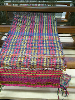
Following formative feedback from peers and my tutor I decided to experiment with more textured yarns as well as looking at weaving techniques to change the surface of the fabric. Here I have added a colourful extra weft to help brighten up this black and white warp. I have also tried very hard to contrast my yarns in order to get the full effect and create a considered composition.


I also found that the way I was presenting my research appeared to resemble patchwork (an area I am very interested in) and so I tried to use looms with warps and patterns that would best reflect this.

Again in these samples I was looking to create a patchwork kind of effect using my colour pallet. I also experimented with floats and thickness of yarn. I feel this definitely reflects my research which seems to be starting to draw focus on plants and their environments. 

I was also very pleased to find an artist whose textural weaving and bright colour scheme was very inspiring to me. 
Vanessa T Cunningham

Wednesday, 23 October 2013

Construct - Weave

This week we have started our textile world - Construct and our first three weeks will be spent weaving. This is a mood board that we were asked to create in order to narrow down our colour pallet and start to think about a theme for our project. I have found this process very helpful as it shows my progression from initial, primary research, to drawings, to wrappings and colour squares which will be very useful to me when picking yarns and deciding proportions in compositions.  
Making a warp for the weaving loom was a lengthy process, but as you can see, I managed to use many of the colours from my mood board and colour pallet and once used to the counting and mathematics, I began to find the process very therapeutic.  


Using a warp of the same colours as the one we made, I tried my hand at hand loom weaving for the first time! Continuing to use my colour pallet and drawings to help guide my weaving, I began to experiment with different patterns and and a variety of yarns in my weft.


I really enjoyed experimenting with different patterns on various looms and feel like I am starting to create samples that are very relevant to my research.

Monday, 7 October 2013

Research Drawings

These are just a selection of images taken during the "Map the City" drawing/research project. Although the 16 "Chance cards" with different drawing techniques to complete were biased towards the use of black, white an tones, I made an effort to involve as much colour as possible. 

I also enjoyed using new materials such as Guache paints and Indian inks alongside more familiar techniques such as collage. I feel the use of colour and my more textural approach has helped me to place myself in the appropriate "Textile Worlds" of construct and mixed media. 

This piece was a response to a "chance card" asking us to draw shadows. Usually my drawing style is more illustrative and not quite true to life, however using water colour to paint the outlines of the shadow created by my bracelet, I found, was a nice way of creating a more literal drawing. 

This drawing responded to a "Chance Card" asking us to do a drawing on crumpled paper. The drawing is of a mosaic piece of art on the outside of Affleck's Palace. I found crumpling the paper was a great technique enabling me to replicate the mosaic effect by drawing along the creases. 

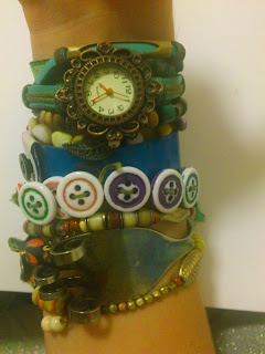
This a collection of objects I often wear on my wrists, that inspired me to think more about proportion, colour and composition. I also drew this collection to help me relate the tools I use to draw, to the materials I am drawing (e.g. acrylics for plastic, pastels for fabric or yarn etc). 


I am really glad I completed all 16 drawing tasks, because although drawing is not something I often enjoy, it has helped me find techniques and materials that I enjoy using (collage, inks, Guache, pastels, paper cutting). This makes me feel less reluctant to approach drawing tasks in the future.